•Graphic Design in relation to Fine Art
•Graphic Design in relation to Advertising
•Graphic Design as a tool of Capitalism
•Graphic Design as a Political tool
•Graphic Design and Postmodernism
•Graphic Design and Social Conscience
Visual communication has been practised as early as 15000bc. Examples include Bison and horses Cave paintings discovered in Lascaux in France.
Giotto di Bondone, Betrayal, c. 1305, Fresco, Arena Chapel, Padua, Italy
An artist paid to represent secenes from the Bible, similar to a Graphic Novel
John Everett Millais, Bubbles, 1886, Pears Soap advertisement
Introduction of the term ‘Graphic Design’:
1922, William Addison Dwiggins (successful designer):
‘In the matter of layout forget art at the start and use horse-sense. The printing-designer’s whole duty is to make a clear presentation of the message - to get the important statements forward and the minor parts placed so that they will not be overlooked. This calls for an exercise of common sense and a faculty for analysis rather than for art’.
Quotes about Graphic design
Herbert Spencer: ‘Mechanized art’
Max Bill and Josef Muller-Brockman: ‘Visual Communication’
Richard Hollis: ‘Graphic Design is the business of making or
choosing marks and arranging them on a surface to convey
an idea’
Paul Rand: ‘… graphic design, in the end, deals with the
spectator, and because it is the goal of the designer to be
persuasive or at least informative, it follows that the
designer’s problems are twofold: to anticipate the spectator’s
reactions and to meet his own aesthetic needs’.
‘Although graphic design as we know it originated in the
late nineteenth century as a tool of advertising, any
association today with marketing, advertising, or capitalism
deeply undermines the graphic designer’s self-image.
Graphic design history is an integral part of advertising
history, yet in most accounts of graphic design’s origins
advertising is virtually denied, or hidden behind more
benign words such as “publicity” and “promotion”. This
omission not only limits the discourse, but also
misrepresents the facts. It is time for graphic design
historians, and designers generally, to remove the elitist
prejudices that have perpetuated a biased history’.
Steven Heller, Eye, No. 17, 1995, reprinted in Bierut, M., Drenttel, W., Heller, S. and Holland, D.K (eds.), (1997), Looking Closer 2, New York, Allworth Press, pages 112 - 119
Is it Graphic Design?
Aristide Bruant, 1893, poster
Henri de Toulouse-Lautrec,
La Goulue, 1890s, poster
‘Whatever the information transmitted, it must, ethically and culturally, reflect its responsibility to society’. Josef Muller-Brockman Aristide Bruant, 1893, poster
Early stages of the lines blurring between posters, fine art and advertising.
 |
Alphonse Mucha, Job, c. 1898, poster for cigarette papers |
Graphic composition
Koloman Moser, 13th Secession
Exhibition, 1902, poster
Charles Rennie Mackintosh,
Scottish Musical Review, 1896, poster
Form and Function becomes more evident. especially in Europe as opposed to Britain.
Peter Behrens, AEG, 1910
New use of Graphic design in GB however still vey conservative and fairly traditional.
Savile Lumley, Daddy, what did YOU do in the Great War?, c. 1915, poster
British stiff upper lip V US
Alfred Leete, Britons [Kitchener]
wants you!, 1914, poster
James Montgomery Flagg,
I want you for U.S. army, 1917, poster
Whereas Germany is far more Graphic
Julius Gipkens, Trophies of the Air War, 1917, poster
Around 1923 when Kandinsky was producing Modern Art, Graphic Design started to become more abstract.
Wassily Kandinsky (1886 - 1944), Composition VIII, 1923
GEOMETRIC
El Lissitzky, Beat the Whites with the Red Wedge, c.1919, poster
An example of Traditional Graphic Design in Britain which is figuritive and geographical:
F.H. Stingemore (UK), London Underground Map, 1931 - 2
However Harry Beck in 1933 was starting to be topological rather than geographical. Thsi was representational oof a Graphic piece if design.
Henry C. (Harry) Beck (UK), London Underground Map, 1933
After Harry Beck, London Underground Map
Simon Patterson managed to make Fine Art out of a piece of Graphic Design. Football, comedians, actors, 'stars' in a constellation
Simon Patterson (1967 - ), The Great Bear, 1992, lithograph on paper
In 1922, The Bauhaus Modernist logo was represenative of the new rules and starts setting the European precedent in graphic Design.
Oskar Schlemmer (German), Bauhaus logo, 1922
Laszlo Moholy-Nagy (Russian), Painting Photography Film, 1925, book cover
Bucking the trend of horizontals and verticals:
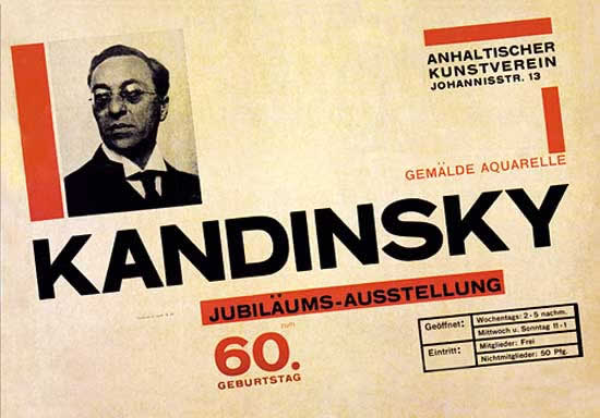
Herbert Bayer (German), Kandinsky 60th Birthday exhibition, 1926, poster
Piet Zwart (Dutch), Het boek van PTT, 1938 (Dutch telephone service book)
Swiss Cutting edge Graphic Design
Herbert Matter (Swiss), Swiss Tourist Board, c. 1932 - 34, posters
A.M. Cassandre (French), L’Intransigeant, 1925, newspaper poster
Abstract graphic design ie railwtay line represents whole railway/train
A.M. Cassandre (French), Etoile du Nord, 1927, poster
Versus 1937 in Britain where still conservative , fine art based and traditional
Tom Purvis (UK), LNER, 1937, poster
In Germay the Bauhaus was closed in 1933 by the Nazis as the Modernist concepts did not fit in with his traditional values.This started a period of an odd juxtaposition in posters 'Traditional figuritive' v Degenerate Art' (Nazis term used for modern art).
Ludwig Hohlwein (German), Reichs Sports Day for
the Association of German Girls , 1934, poster
Ironic poster which is both Graphic and modernist which was chosen by Hitler to advertise the 'What is bad about Modern Art exhibition'
Ludwig Vierthaler (German), Degenerate
Art, 1936, exhibition poster
1942 Figuritive, conservative Graphic Design promoting good health
Hans Schleger (German, working in UK), Eat Greens for Health, 1942, poster
1936 Spain An underground movement using Graphic design really effectively
opposing Budget cuts
Josep Renau (Spanish), Industry of War, 1936
Propaganda- Russia celebrating freedom
Josep Renau (Spanish), Stalingrad: The New Star of Freedom, 1942
No text needed
Pere Catala i Pic (Spanish), Let’s Squash Fascism, 1936
Constructivism - Political posters set the benchmark
V. Deni & N. Dolgorukov (Russian), Our Army and Our Country are strengthened with the Spirit of Stalin!, 1939
G. Klucis (Russian), In the Storm of the
Third Year of the Five Year Plan, 1930
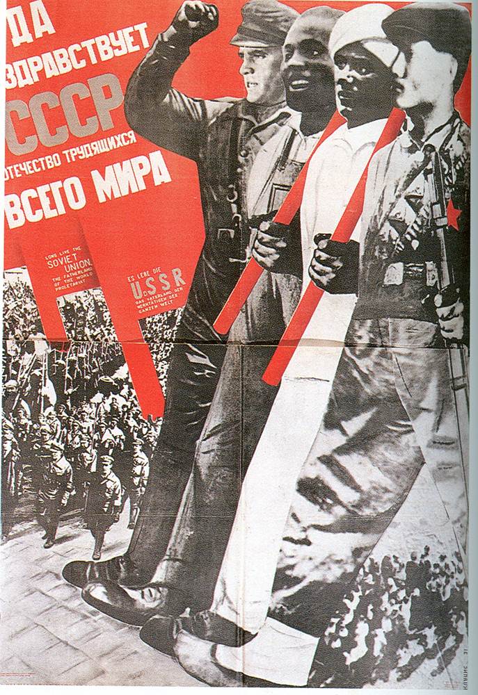
G. Klucis (Russian), Long Live the USSR –
Fatherland of Workers of the World, 1931
Postwar celebrating victory against facist and promoting economic boom.
Graphic designers in Britain such as Abram Games were starting to become influential.
Abram Games, catalogue for ‘Exhibition of Science’, Festival of Britain, 1951
1946 new commercial nature of advertising lead by US graphic Designers such as Paul Rand
Paul Rand, advert for Jacqueline Cochran, 1946
Classic British Ad - using negative space,minimalism used to make people sit up and recognise.Brand association VW not just about words eg Sainsbury's tried to use an italised logo on their own brand coke howeve cocacola appealed to ban it.
Helmut Krone for Doyle Dane Berbach, Think Small, advert for Volkswagen, 1959
Graphic designer Saul Bass poster style gave Hitchcock films a 'brand'
The Man with the Golden Arm, 1955
Alfred Hitchcock’s Vertigo, 1958
Saul Bass, title graphics for Anatomy of a Murder, 1959
Paul Rand was at the fore of commercialism and the growth of branding
Paul Rand, logo for American Broadcasting Company, 1962
Paul Rand, poster for IBM, 1970
Ken Garland is a British Designer who wrote the 'First things first manifesto'. He presented an argument that there was more to life than being part of a capitalist society . Life should be more meaningful
‘We have been bombarded with publications
devoted to this belief, applauding the work of those
who have flogged their skill and imagination to sell
such things as: cat food, stomach powders,
detergent, hair restorer, striped toothpaste,
aftershave lotion, beforeshave lotion, slimming
diets, fattening diets, deodorants, fizzy water,
cigarettes, roll-ons, pull-ons and slip-ons …
Ken Garland, First Things First Manifesto, 1964
‘There are other things more worth using our skill
and experience on. There are signs for streets
and buildings, books and periodicals, catalogues,
instructional manuals, industrial photography,
educational aids, films, television features,
scientific and industrial publications, and all the
other media through which we promote our trade,
our education, our culture and our greater
awareness of the world’
Ken Garland, First Things First Manifesto, 1964
F.H.K. Henrion, Stop Nuclear Suicide poster, 1960
Designed 'CND' logo symbol now come to represent peace
Seymour Chwast/Push Pin Studio, End Bad Breath poster, 1968
About War veterans and B52 bombers
Art Workers Coalition, Q. And Babies? A. And Babies, 1970
This was an order to soldiers in Vietnam War (IS text necessary?)
Hipgnosis, 10CC, Deceptive Bends sleeve design, 1977
Prog rock over-eleborate album cover representative of this period in Music
followed by backlash from Punk movement
'DIY art work'
Jamie Reid, Sex Pistols, Never Mind the Bollocks … sleeve design, 1977
Peter Saville, FAC 001, The Factory Club Night poster
First poster as student of Graphic Design for Factory records apparently delivered after the gig which appealed to Tony Wilson so he used it anyway..
Peter Saville, New Order, Blue Monday, sleeve design, 1983
Nortorious 12 inch single which is an example of packaging becoming as important as product. Elaborate folded design. An example of Graphic Design Vering away from capitalism. Factory Records lost as lot of money as highest selling 12 inch single ever and they were losing 30p a copy...
Neville Brody, The Face magazine covers, 1980s
Key figure in British Post Modern graphic design who revolutionised typesetting.
David Carson, Ray Gun, double page spread
Simliar to Brody but in US Carson with the rise of the grunge movement re- wrote the rules, jumps around. Has it become Graphic design for its own sake, an object of beauty or non-functional.
David Carson, Don’t mistake legibility for communication
Examples of post modern design
Public Image Limited, album, sleeve design, 1986
Trying to undermine graphic design in terms of branding, aware of the trappings of consumerism however is it aesthetic in its own right?
Public Image Limited, compact disc, cd packaging, 1986
Peter Blake, Band Aid, Do they Know its Christmas?, 1984
Chumbawamba, Pictures of Starving Children Sell Records, 1986
Mocking charity records
Designers Republic, Pop Will Eat Itself, Ich bin ein auslander, sleeve design, 1994
Julian House (for Intro), Primal Scream, Xtrmntr, sleeve design, 2000
Reflects the cut and paste techniques used in the interwar years , is it trying to align the music to this?
Mark Farrow (Farrow Design), Spiritualized, Ladies and Gentlemen we are floating in space, CD packaging, 1997
Graphic design becomes the product instead of the CD - Represents a packet of pills. Once opened the product as limited value yet can listen to cd. Eah 'pill' is cd size. Cost £70 to buy. How useful is this?
Mark Farrow (Farrow Design), Spiritualized, Ladies and Gentlemen we are floating in space, limited edition CD packaging 1997
Time Magazine, cover, September 14th 2001
THIS CD WAS RELEASED IN AUGUST 2011 BEFORE THE TWIN TOWERS DISASTER IN SEPT 2001. THE TWIN TOWERS TO BLACK AMERICA SIGNIFIED US WHITE WEALTH. WAS WITHDRAWN
Key thinker ' looking closer theory'
‘Evidence of designer concern is found in the form of well-meaning but woefully
masturbatory poster exhibitions and portfolios organized on general humanistic
themes such as peace, human rights and the environment’
Steven Heller, 1991
Jonathan Barnbrook, Bastard typeface, 1990
'GOTHIC'
Jonathan Barnbrook, Olympukes
Was this self congratulatory or raising awareness?
Naomi Klein - A well regarded theorist although quite subjective
‘Quite understandably, the people behind these
campaigns have come to think of themselves as
cultural philosophers, spiritual guides, artists, even
political leaders. For instance, Benetton, rather
than using its ads to extol the virtues of its clothing,
opted instead to communicate what Oliviero
Toscani believed to be fundamental truths about
the injustice of capital punishment. According to
the company’s communication policy, “Benetton
believes that it is important for companies to take a
stance in the real world instead of using their
advertising budget to perpetuate the myth that they
can make consumers happy through the mere
purchase of their product”’.
Naomi Klein, Truth in Advertising, 2000 (in Looking Closer 4, page 64)
Benetton -'Are they trying to make us think or raise awareness or simply trying
to make you believe it is 'good' to wear Benetton?'
How long does this type of imagery stay shocking?
Oliviero Toscani, Benetton adverts 1992
‘It seems like a noble goal, yet Benetton’s political branding
campaigns implicitly promise customers a happiness of
another sort – not just beauty, status or style, the traditional
claims fashion companies make, but virtue and engagement.
And that’s where the problems arise, because this claim is
simply not true. Benetton’s clothing has nothing to do with
AIDS or war or the lives of prisoners on death row, and by
using these issues in sweater advertisements, Benetton is
inserting a layer of distance and mediation – represented by
the Benetton name itself – between consumers and these
important issues’.
Naomi Klein, Truth in Advertising, 2000 (in Looking Closer 4, page 64)
‘While the publicity generated by such
campaigns [Benetton] is immense – and
their globalized distribution protects them
from the effects of a ban in any one country
– it is also surely shocking that the shock
effect wears off so quickly. Perhaps the
overall driving motive of such campaigns is
in fact nothing new – but simply an astute
loyalty to one of the oldest adages in the
business: there is no such thing as bad
Publicity’
Cook, G. (1992), The Discourse of Advertising, London, Routledge, page 229
Kruger is a fine artist. However when she allows Selfridges to use her art work is
she selling out or is she mocking the customer?
Barbara Kruger, I shop therefore I am, 1987
Barbara Kruger/Selfridges,
I shop therefore I am, 2006
‘For the last decade, as a profession,
graphic designers have been either
shamefully remiss or inexcusably ineffective
about plying their craft for social or political
betterment’
Steven Heller, 1991
‘Once we’ve acknowledged that designers
have certain inherent limitations as message
bearers, the question which must be asked
is: “Can graphic designers actually do
something to change the world?”’
Steven Heller, 1991
‘The answer is “yes”, if one disregards the
fact that there are very limited outlets for this
kind of work, and accepts the fact that being
socially responsible means taking the
initiative oneself, dealing rationally with
issues, and having a commitment to a
specific cause’
Steven Heller, 1991
Judy Blame, Keep Britain Tidy t shirt, 1992
‘We are a global network of culture jammers and creatives working to change
the way information flows, the way corporations wield power, and the way
meaning is produced in our society.’ http://www.adbusters.org/
Are Adbusters raising awareness or is it self congratulatory?


