Friday 25 February 2011

Task 4 Post Modern Graphic Design

Find five images of what you consider to be Postmodern Graphic Design. Post these to your blog, with reference to date, author and title in the following form-
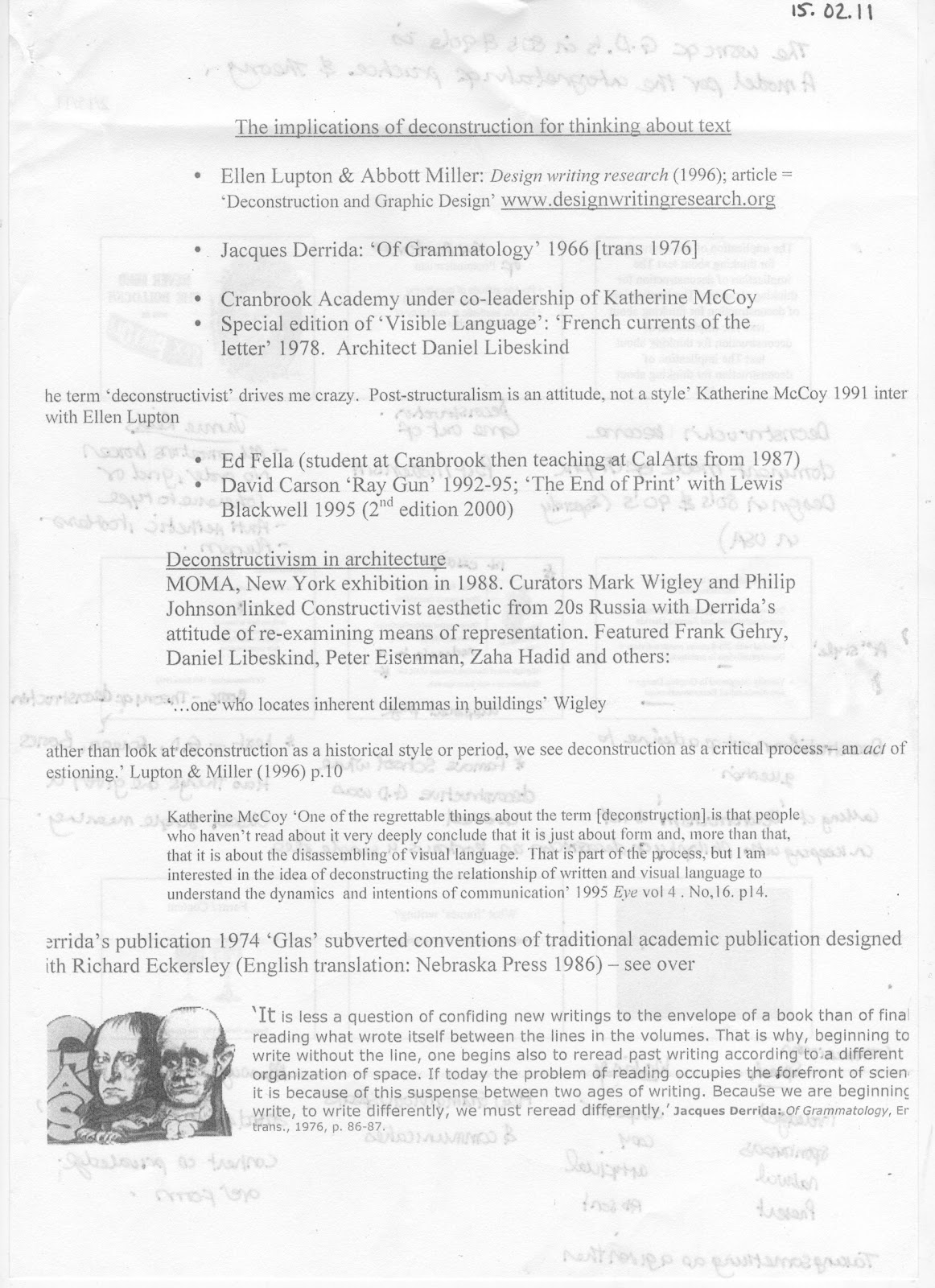
Author (date) 'Title', full web URL


e.g. Miles, R (2010) 'A piece of Postmodern Graphics', www.graphics.com/graphics


Also, include a couple of sentences next to each image which describe why you think each image is Postmodern.


The Collection 100 brief led me to do extensive research on the Graphic Designer Barney Bubbles.  He had a design background with five years studying design in the early sixties and went to work for Conran before 1967, the Psychedelic sixties morphing into 'Barney Bubbles'. So he knew the rules of design and was perfectly placed to break them.

The term Post Modern can be applied to a lot of Barney's work especially the Album cover designs from 1977 to 1983.This quote from the Guardian in 1990 made by Simon Reynolds underlines this idea' Generally post-modern artists like to mix the highbrow and the populists, the alienating and the accessible and to 'sample' elements from different styles and eras... now you can reinvent yourself endlessly, gaily pick n' mixing your way through gaudy fragments of a shattered culture'

This is also reinforced by Peter Saville:“The work of Barney Bubbles expresses post-modern principles: that there is the past, the present and the possible; that culture and the history of culture are a fluid palette of semiotic expression and everything is available to articulate a point of view.”
Peter Saville, Reasons To Be Cheerful: The Life & Work Of Barney Bubbles

These are four examples of his work which demonstrate a Post Modern style:

Bubbles, B (1977) 'Music is for pleasure album cover for The Damned'


This album cover does not attempt to disguise the Kandinsky inspiration, underlining the Post Modern concept of originality not of primary importance.  The type face is almost unreadable again fitting with the Post Modern attitude of questioning convention ie that Typefaces are simple, legible and readable. 


Barney designed several similar typefaces.  one notable being for the NME Book of Modern Music, a free supplement which preluded the redesign he did in 1978 :
Bubbles, B (1978) ' The NME Book of Modern music'

This is a borrowed from 20's Russia, 60's  Britain and Beyond.


Bubbles, B (1977) 'Front cover, 7" sleeve. Your Generation/Day By Day, Generation X, Chrysalis'

Berlewi, H  (1924) 'Composition In Red, Black And White.' 

Generation X's manager John Ingham was looking for a distinctive art direction for Generation X when they were directed towards Constructivism by an Art curator friend.  By coincidence Barney, Art director for Stiff Records, also loved this period and they were brought together by John's girlfriend Sue Spiro who was working at Stiff records.
The Your Generation sleeve is one of the clearest examples of Barney’s distillation of art history references. Using Berlewi’s painting as a springboard, Barney reassembled the elements into a multi-layered  piece which accurately expressed the visual minimalism and energy of the punk period, led by the “45″ pun on the rpm of the 7in single contained within, and the geometric representation of a record being played from above.


The deliberately off register CMYK on Elvis Costello and the Attractions This year's Model is another example of a Post Modern aesthetic.  The E and T appear to have been cut off.  Apparently when this went to America the record execs didn't get the Joke so the album was released with the straight cover.   This is a good example a Post Modern Graphic Designer with a sense of humour who did not take himself too seriously or feel he had to follow the rules.

Bubbles, B (1978) 'This Years Model album Cover Elvis Costello & the Attractions' 


Jeffrey Keedy is a Graphic Designer who graduated from the Cranbrook Academy in 1985.  In 1989 he designed a typeface called Keedy Sans.  To quote the designer from the Emigre website 'Most typefaces are logically systematic; if you see a few letters you can pretty much guess what the rest of the font will look like. I wanted a typeface that would willfully contradict those expectations. It was a typically postmodern strategy for a work to call attention to the flaws and artifice of its own construction. But I never thought of it as being illegible, or even difficult to read. I have never been very interested in pushing the limits of legibility for its own sake. Absolute clarity, or extreme distortion, is too simplistic a goal, and it is ground that has already been well covered. I wanted to explore the complex possibilities that lie somewhere in between and attempt to do something original or at least unique.
At the time I had been using the American highway Gothic typeface in my design work that I cut and pasted from a highway signage manual. Another vernacular influence was the "f" from the Fiat logo. But I was not only quoting low vernacular sources; it was important that I mixed in high design sources as well. So I was thinking about Akzidenz-Grotesk Black, which was somewhat exotic in America, because I liked Wolfgang Weingart's typography. Overall I wanted a typeface that was similar to Cooper Black, extremely bold with a strong idiosyncratic personality. I think it is a very postmodern typeface in that it included "high" and "low" vernacular quotation, and it is self-consciously crude and anti-aesthetic in reaction to the slickness of Modernism.' http://emigre.com/EFfeature.php?di=100

Keedy, J (2002), 'Emigre Type Specimen Series Booklet No. 4 Keedy Sans'


i-D magazine was launched in 1980, the covers were created by Art director Terry Jones.   The strong colours, use of collage and experimental type quickly started to both represent and influence the rise of Postmodern and New wave youth culture.
i-D Magazine July 1981 (Accessed 20 February 2011)

Graphics by Malcom Garrett which is a nice link as Malcom Garrett quotes Barney Bubbles as a huge influence on his career


Tantrum Magazine May 1984  (Accessed 20 February 2011) photograph of Madonna by Mark Lebon

Carin Goldberg is an American Graphic Designer whose book cover designs in the 80's became iconic of Postmodern style, especially the 1986 reissue of  Ulysses by James Joyce


Golberg, C (1986) 'Front cover Ulysses by James Joyce Random House' http://caringoldberg.com/BookJackets/more/jackets_more_44.html

Ironically after reading this Blog Interview with her I can see she is slightly frustrated by the  'Postmodern' label, particularly with the constant referance to Ulysses.  In her 30 year career she has only ever tried to solve problems in the best way she can. Her Postmodern aesthetic is more succinctly demonstrated by considering another of her book cover designs.  

In an Ellen Lupin article she discusses how Goldberg brought the Postmodern ideas of ' decoration, pastiche, and eclecticism' to Book Design.   The '1985 cover for Rainer Maria Rilke’s Sonnets to Orpheus, she borrowed from the graphic style of the Vienna Secession, creating densely ornamental lettering locked together within a heavy linear framework. Her design is directly modelled after Josef Hoffmann’s 1903 identity for the Wiener Werkstatte.' Available at  http://elupton.com/2010/07/goldberg-carin/ (Accessed 20 February 2011)

 Goldberg, C (1985) 'Rainer Maria Rilke’s Sonnets to Orpheus' http://caringoldberg.com/BookJackets/bookjackets13.html


Friday 18 February 2011

Task 3 - Avant Garde

In approximately 300 words discuss the concept of the 'Avant Garde' in relation to two examples of Graphic Design. Include pictures and full references to the works you are discussing.

The term Avant Garde was derived from the French military term meaning literally the part of an army which goes ahead of the rest.  First associated with some 19th century forward thinkers who saw the social power of Artists, along with scientists and industrialists, would be leaders in society.  The term is often used in association with various Modernist groups of artists and designers from around 1908, including Cubists, Futurists and Constructivist. These groups were forward looking activists wishing to free art from the elite middle classes.    A term now applied to art and design to convey innovative, experimental work, which is judged on the originality of the vision and ideas of the artists or designer. 


                                                                   Figure 1                                                                                    Tullio D'Albisola Parole in Liberta Futurist (The words in freedom)   
      Metal cover for a book by Filippo T. Marinetti 1932

Italian writer, poet and critic Marinetti and the other poets, painters and sculptors embraced a 'new religion of speed' and their modern spirit was represented through the machine, the automobile and the aeroplane.  The metal book shown above, one of Marinetti's later Futurist manifestos, symbolises the Futurists affinity with the machine age. The book was made up of many different colours on metal pages with a metal binding.  It represents the pinnacle of the Futurist's innovations in book making, poetry and typography. 
Futurists used manifestos to spread their philosophy and also to create controversy in the academic and conservative world.  Its roots were founded in poetry, a desire to innovate language and a rejection of nostalgia.  The typography used on the front cover above is typical futurist innovative style. A mixture of newly designed typefaces, different font sizes and colours and no respect to the rules of layout.  This manifesto was printed by Lithographic process, a characteristic of Futurist books which were emblems of technical and cultural progress.

  
Figure 2
Postcard. For the all Unio Spartakiada spoting event. 1928. Design by Gustav Klutsis. Lithograph on cardboard


Figure 3
Artist: Gustav Klutsis & Sergei Sankin
Title: 1st of May Solidarity.
Year: 1930
Klutsis, an accomplished Constructivist after studying under Lissitzky, was a pioneer of Photomontage.  This technique went on to be adopted by other Avant Garde Russian Constructivist mainly for design supporting the program and ideology of the emerging Soviet State.  Ironically whilst emerging as Avant Garde, photomontage went on to be one of the only graphic techniques that the Progressives and Conservatives accepted as effective visual communication. 

The asymmetrical typography especially in image 3 is a Klutsis signature.  The innovative simple but bold imagery embodies the Constructivist belief that art should be a language that speaks to the masses.

Bibliography

Heller, S. & Chwast, S. (1988) Graphic Styles from Victorian to Post Modern London. Thames & Hudson


Sunday 13 February 2011

Biblography

Bibliography                                                                                                     
Barnard, M (2005) Graphic Design as communication. Oxon: Routledge
Grunenberg, C. (2005) Summer of love Art of the Psychedelic Era. London: Tate Publishing
Hollis, R. (2001) Graphic Design – A concise history. London:  Thames and Hudson
Hebdige, D. (2003) Subculture- The meaning of style. England: Routledge
Heller, S. (2010) Pop – How graphic design shapes popular culture. New York: Allworth
Heller, S.and Chwast, S. (1988) Graphic Styles from Victorian to Post-Modern. London: Thames and Hudson
Jackson, L.(1998) The sixties- Decade of revolution’. London: Phaidon (Note 1)
Raimes, J and Bhaskeran L. (2007) Retro graphics A visual sourcebook to 100 years of graphic design. San-Francisco: Chronicle
Rizot, J. (2006) 200 Trips from the counter culture graphics and stories from the underground press syndicate. London: Thomas and Hudson
Taylor, S.(2006) 100 years of magazine covers. London: Black Dog Publishing
De Ville, N. (2003) Albums – Style and image in sleeve design. London: Mitchell Beazley
The Guardian. 2009. Available at http://www.guardian.co.uk/artanddesign/2009/oct/01/michael-english-obituary  (Accessed December 2010)
The Times .2007. Available at http://entertainment.timesonline.co.uk/tol/arts_and_entertainment
/music/article1645087.ece (Accessed January 2011)
The Victoria & Albert Museum collections .2010.  Available at  http://collections.vam.ac.uk/item /O129172/poster-ufo/ (Accessed December 2010)
Websites and newspaper articles on the International Times
The Guardian. 2009 . Available at http://www.guardian.co.uk/books/2009/may/01/obituary-tom-mcgrath-poet (Accessed December 2010)
The International Times archive.2009.  http://www.international-times.org.uk/ITarchive.htm (Accessed December 2009)
A database.org - The International Times database. 2006.http://itarchive.adatabase.org/tools/archive_viewer
.php?id=7644#page=(page 2) (Accessed December 2010)
For websites for OZ magazine http://web.archive.org/web/20060822120343/www.oztrading.net/Library.htm
Note  1. Lesley Jackson is a London-based design curator, historian and author specialising in twentieth century design

Essay - Counter culture and psychedelic art – hidden in a veil of colours?

On the 13th April 1966 Time magazine described London as the ‘swinging’ city.  Fashion, style and counter culture had arrived both as a result of the middle class youth becoming dissatisfied with the ‘establishment ‘and  also following a move away from the conservative and modernistic fifties and early sixties.  The author Richard Hollis explains the term ‘underground’ which was used ‘to describe the anti-establishment attitude of many of the young middle class in the 1960’s who took an alternative cultural or political stance outside and opposite to conventional society’ (2001, P182).   
In his book, Subculture- The Meaning Of Style, Hebdige wrote that ‘the members of a subculture must have a common language. And if style is to catch on … it must say the right things in the right way at the right time’. (2003, p122)  The common ‘anti-establishment’ language for this group was the psychedelic style with a mantra from Timothy Leary of ‘tune in, turn on, drop out’.  In Graphic Styles, Steven Heller wrote that ironically the best definition for psychedelic is ‘Otto Wagner’s term gesamtkunstwerk (the total work of art), for it connotes the hippie movements return to communal living, its attempts at arts and crafts production, and its union of art, music and literature.’ (1998, p210)    
This underground community was given a voice in the form of counter-culture newspapers, The International Times (IT), launched in October 1966 and OZ launched in February 1967. In the words of Nigel Fountain quoted in Tom McGrath’s obituary, the International Times ‘did signpost the moment when the decade turned and a subversive culture mattered’ (The Guardian, 2009)
The founders of IT, John Hopkins, Jim Haynes and Barry Miles had recently opened The London Free School,  providing a middle class education to the under-privileged;  a radical bookstore and gallery, Indica and went on to open the legendary UFO night club.  Tom McGrath was recruited as the founding editor and Mike McInnery as Art Editor.  Tom was influenced by the American ‘Beatnik’ poetry and literature and had been editor of ‘Peace News’ for two years.    A quote from the editorial sets the scene ‘one thing everyone connected with this paper agrees on is the need for change’… ‘and we have put out IT in the belief, that many other people, especially young people will agree with us’(1966, p2) This is said in the context of a CND supporter, afraid of atomic war between US and Russia, following two years into a Harold Wilson lead Labour government.  The new Labour government ignored the anti-nuclear feeling of many labour supporters and continued with the previous conservative policy.
Oz, first launched in Australia in 1963 by Richard Neville and Martin Sharp, was brought to London in February 1967.  Australian artist Martin Sharp influenced the psychedelic appearance of the magazine when he started experimenting with LSD.  The magazine, whilst trying to attract the growing counter-cultural hippies, was actually competing against Private Eye as a satirical political magazine; being published every other week to the fortnightly Private Eye.
The covers and content of IT and Oz were often controversial, political and included news of happenings and the latest developments in music and theatre.  A regular feature in IT for example was ‘The Interpot Report’ which recorded the price of marijuana around the world.  Some iconic and revolutionary figures contributed to both magazines including Germaine Greer, Allen Ginsburg and John Peel.
The IT cover (figure 1) illustrated by Mike McInnery, is promoting an IT benefit event ‘14 hour Techni-colour dream’ staged at Alexander Palace in 1967.  The image of silent movie actress Theda Bara, mistaken for the ‘IT’ girl Clara Bow by the team, was present on most covers as the logo.   The typeface of the masthead is deliberately lowercase to give a graphically raw feel.  The bright colours typical of many posters and art work at the time were influenced both by the stroboscopic lightshows and the visual experiences from mind altering drugs.  This together with the illustrative ink drawing and almost illegible lettering was typical of the Psychedelic style becoming so popular at this time.   The semi naked appearance of the person in the foreground leaves no doubt that this is a woman.  The ‘swirl’ appearing from her head connotes her experiencing a drug altering vision.  The other person in the background who appears to be blowing bubbles reinforces this; a feature of the lights shows which led to the morphing of graphic artist Colin Fulcher into Barney Bubbles.  
Whereas IT were striving for a ‘hot off the press’ revolutionary feel, OZ had a more art directed, sophisticated style.  The cover of Issue 3, figure 2, was designed by Martin Sharp. The masthead of OZ, typical of the psychedelic style is only just readable, as the ‘O’ has been illustrated with an eye.  The eye and the message ‘we are watching big brother’ denotes these underground journalists are keeping an eye on the establishment on behalf of its readers.  Graphic invention was to become a trademark of OZ.  Every issue employed a different masthead in a different position on the cover thus breaking with the industry standard of set recognizable logos.
Sharp has included a pastiche of the ‘classic’ Mona Lisa smoking a cannabis joint in the same vein that in 1883 Sapeck painted her smoking a pipe and in 1919 Marcel DuChamp added a moustache.  This was done as much for humour as to challenge academic tradition.  The bananas are suggestive of phallic symbols, which were common in art signifying the freedom being experienced during this period of sexual revolution.  Both ‘What makes hippies happen on the psychedelic bus?’ and ‘Love me I’m an ugly failure’ are cover lines for articles.  The whole piece is printed in ‘day-glow’ pink and other bright colours.
Psychedelic art is not only recognisable for its anti-establishment form of expression it was also influenced by art from the turn of the 19th century.  Mulcha, Beardsley and the Pre-Raphaelites iconography can all be detected in the psychedelic style.  Lesley Jackson defines two types of revolution in design, which was occurring in the 1960’s.  The first was a revolution in the sense ‘wanting to change the world’.  As People began to tire of the ‘modern’ they began to rediscover the Victorian design, which had been out of vogue.  The second a ‘revolution in the more literal sense of ‘rotation’.  Historical revivalism after three decades of modern and forward-looking designs.’ (1998,p 9)
   Hapshash and The Coloured Coat, a partnership formed between Michael English and Nigel Weymouth in March 1967, also contributed to OZ and IT.  They produced some of the most memorable silkscreen posters of Psychedelic London and following their popularity, IT and Joe Boyd opened a poster production company called Osiris Visions.  When Malcolm Barnard explores the relation between graphic design and art he proposed, ‘posters, packaging and logos on this account can be more expressive of an age or culture than oil paintings and sculptures.’ (2005, p166).  
British Psychedelic art was over by 1968 only to be copied and tainted by advertisers in the commercial world.  In Sixties – Art of the psychedelic era, Christophe Grunenberg director of Tate Liverpool explains this is one reason psychedelic art ‘has not only been neglected but virtually excluded from the serious histories of the sixties’  (2005, p7).  He goes on to say ‘Its aesthetic, political and social radicalism, it seems, have been obscured by a veil of bright colours’ (2005, p13) The style in fact was a complex interaction between art, drug culture, music, film, technology and counter culture.  As demonstrated earlier with examples from IT and OZ, the style embodies the strong feeling of change and freedom to experiment being experienced over this period.
In the Tate publication, Sixties, American art and culture critic, Dave Hickey defines ‘psychedelic art as ‘anti-academic ‘’ and the reasons for this are the prioritisation of  ‘complexity over simplicity’, pattern over form’, repetition over composition, feminine over masculine’.   He goes onto explain anti-academic styles ‘signify a dissent from their own present’ (2005, p64).  This reinforces the argument that psychedelic style is a form of aesthetic protest and signifying freedom. 
Steven Heller also references psychedelic style several times in his discussion of how graphic design shapes pop culture.  He not only recognises psychedelic style but also states it was ‘a revolutionary graphic language used as a code for a revolutionary generation.’ (2010, p21)
 Oz and IT continued to print into the seventies however the use of radical material meant both faced closure more than once and also prosecution from the authorities.  Issue 28, ‘School kids’ Oz put together by young people aged 14-18 years old led to the longest obscenity trial in 1971.  Anderson and Neville were found guilty and faced heavy fines, sentences and deportation.  At the trial John Mortimer QC said the trail ‘stood at the crossroads of our liberty’. Following protest marches led by John Lennon the convictions were overturned when the trial went to appeal.  The trial sparked a major corruption enquiry at Whitehall which resulted in the conviction of several senior officers.  Counter culture left a marker in history, the divorce between two generations.
   This essay has provided the counter culture context of psychedelic art and tried to demonstrate, despite only recent academic reference, the style was a response to the freethinking, revolutionary and proactive attitude of this visionary generation.   
Figure 1  The International Times vol. 1 Issue 12

Figure 2 OZ issue no. 3