
From the early 20th century different Modernist groups of Graphic Designers were activists who sought to free art from the rich, ornamentation and to influence politics. The Modernist's were forward looking and the Futurists lead the way for Modern communication. The Dutch De Stijl group founded on 1917 favoured Universal harmony with no emotional overtones. They developed a utopian syyle where anything emotional was taboo. All the design featured reactangles and the use of black, white,grey and primary colours.


J Schmidt, 1923, Bauhaus Exhibition,http://picasaweb.google.com/lh/photo/mPQ-M32f96SkmmVg-sHKgg
Although from setting up the Bauhaus, Gropius belived the school should not impose a particular style, there are obvious influences from Constructivism and assymentrical typography. The Bauhaus became the beacon for functional design from breaking down design to its essential elements. All Bauhaus publications had order, symmetry,and a basic reactangular grid with the essential sans serif style typeface. They truely fit the Modernist ideal of 'fitness for purpose'


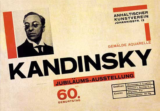
Herbert Bayer Kandinsky's 60th birthday poster 1926. (http://theoryofsupply.com/Herbert%20Bayer/Kandinsky1926.jpg)
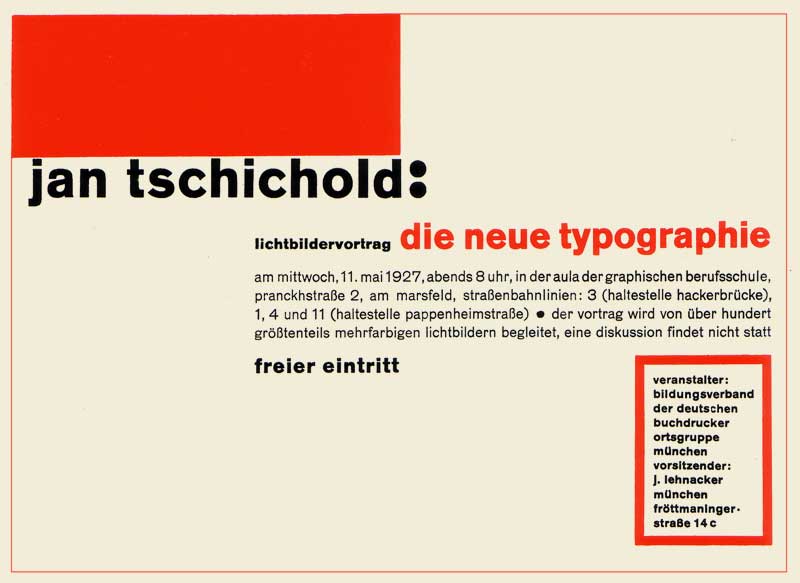
The most recognisable change in Modernist Graphics was seen in typography. Eventually this led to a complete revision of traditional commercial layout. One of t he most devout followers of the new rules was Jan Tschichold who believed the old typography rules viloated the fitness for purpose and deign. He designed the fundamental principles of assymetry in Die Neue Typographie (the New typography). Poster advertising (below)

Lester Beall ,1937, Radio/Rural Electrification Administration, www.metmuseum.org/toah/works-of-art/RL.2001.1.3
Beall (American, 1903-1969)
During this period, the great depression, the electrification of America was a national priority. There are a series of posters promoting the benefits of electricity particularly directed at rural communities. This poster is showing a lone farmhouse on the hill with the radio waves depicted by arrows bringing information into the home. This poster is modernist for two reasons the first is the graphics and images are very simple and also the subject is a reflection of that period in history.

The Beggarstaff Brothers, 1897, Hamlet,http://beggarstaffs.com/catalogue/
Their style was has a stripped down simplicity with abstracted imagery and simple sans serf type. The reason they used this style was 'practicality' The messages are immediate and visible from a distance or from passing vehicles.
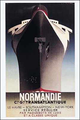
Adolf Mouron Cassandre,1935, Normandie, www.absoluteastronomy.com/topics/Adolphe_Mouron_Cassandre
Geometry was fundamental to French Graphic Designer Cassandre, both in forming the letters and constrcting images. He is a Modernist designer in terms of his definition of thec poster ' A means of communication between sellers and the public...the artist despatches messages.....all he has to do is communicate clearly, powerfully and precisely.' Hollis (1994. P84). This poster is a good example of form follows function as the simple images clearly communicate and could be seen by people in moving vehicles. His images represented the glamorous and sophisticated lifestyle of 1930's.

No comments:
Post a Comment